Outcomes
Project context
Home&Beyond secured major supplier partnerships with design houses and wholesalers, but its D2C and B2B e-commerce performance remains weak despite marketing campaigns and discounts.
With international competitors entering the market, the brand needs to improve direct website conversions, especially for high-value products, and reduce dependency on third-party marketplaces like Amazon.
Problem statement
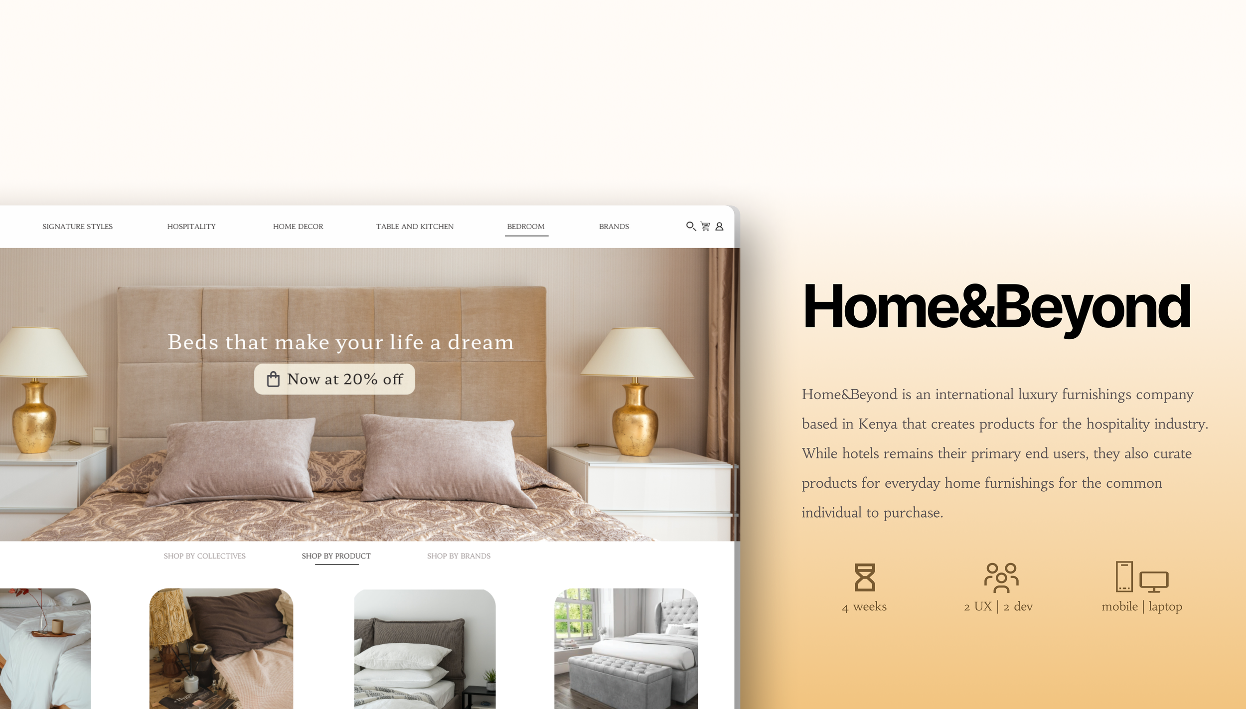
The client sought to redesign the site architecture, information flow, and visual system to improve user journeys and drive direct sales. This redesign supports a broader brand repositioning from international furniture retailer to independent arthouse design studio..
My role
In a lean UX environment with KLoc Technologies, I worked as a design intern with one senior designer and two senior developers on all aspects of the design process, including research, analysis, wireframing, prototyping, A/B testing, and final handoff. I prioritized design activities based on business impact, delivery timelines, and project constraints.
Audience groups
The primary audience is the hospitality sector and contract interior designers. A smaller secondary audience includes individual buyers such as business professionals, homeowners, and architects purchasing lower-volume items like gifts or home décor.
Who really is the audience?
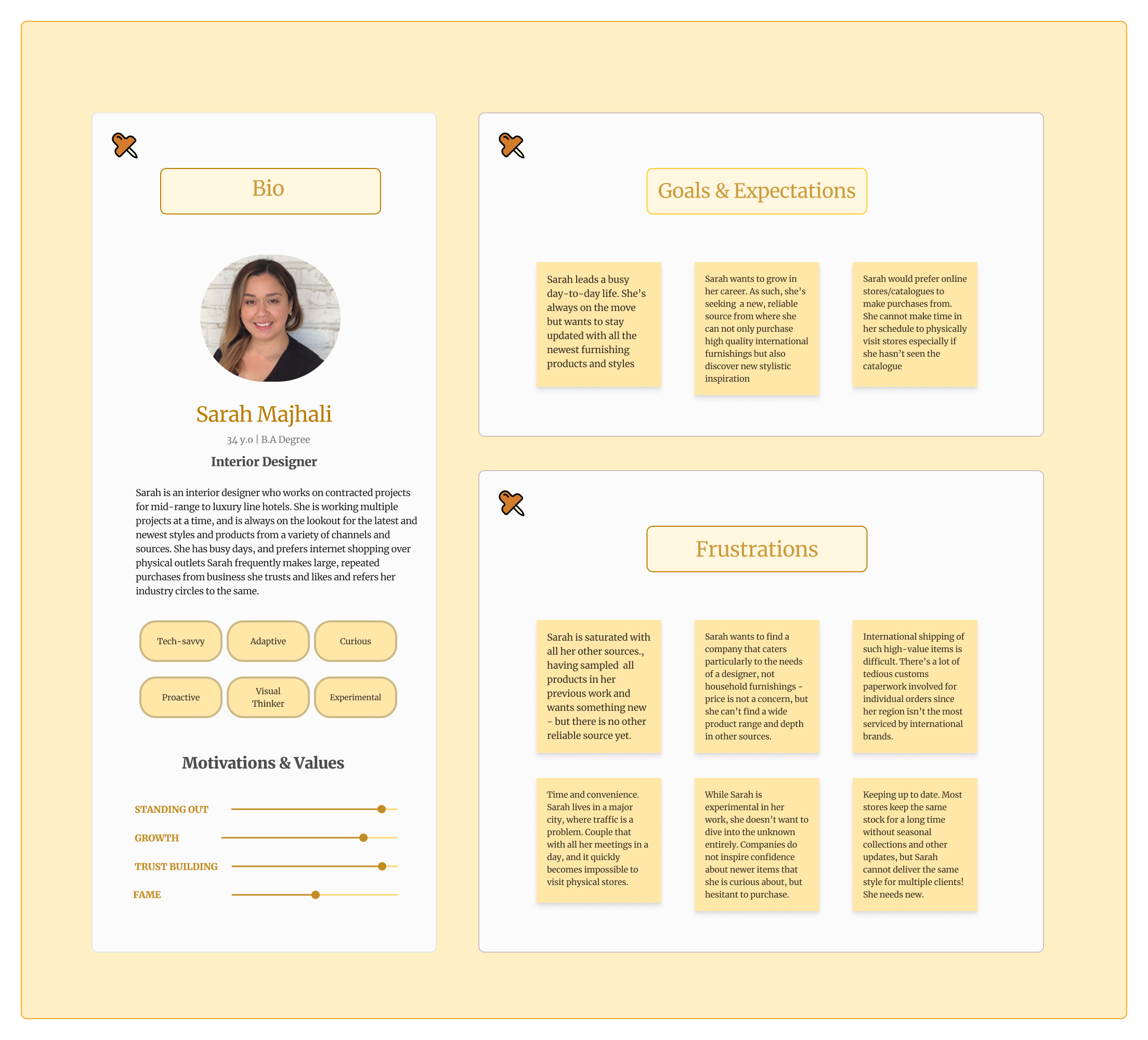
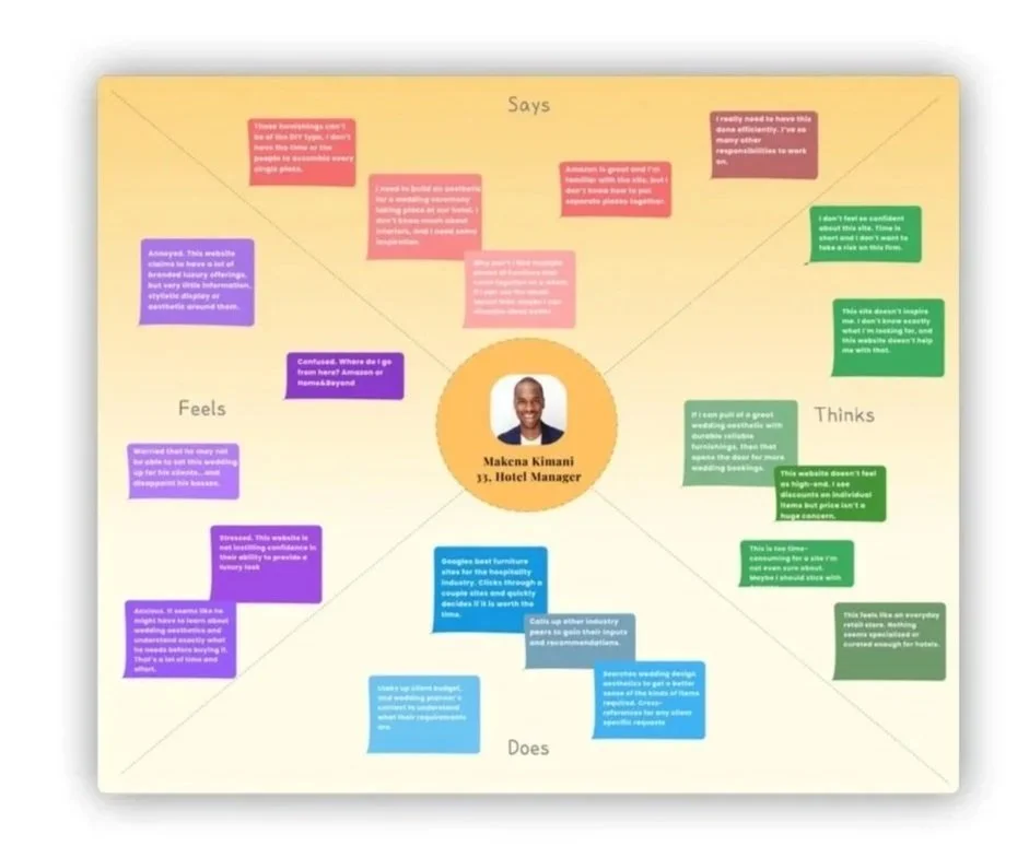
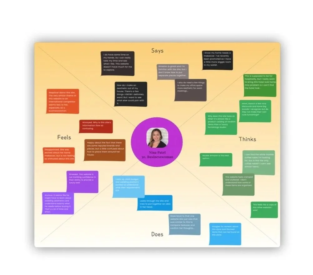
I began by researching the target users’ motivations, values, purchasing criteria, and current perceptions of Home&Beyond’s website. Key questions focused on how hospitality designers and hotel stakeholders source furnishings, what makes a catalogue credible, which products are hardest to find, and why they may prefer third-party vendors over direct purchase.
I conducted remote interviews with 10 representative users via Zoom and Miro, using a semi-structured format to build rapport and capture honest, qualitative insights. The data was coded for thematic analysis and translated into user personas and empathy maps to define user goals, frustrations, expectations, and decision-making patterns.
I then ran usability tests with the same participants across key e-commerce tasks to observe how these attitudes translated into actual website behavior. The combined research outputs informed a customer journey map, highlighting friction points in discovery, trust-building, product evaluation, and direct conversion.

Building a journey map to identify unmet expectations & painpoints
Using insights from usability testing, personas, and empathy maps, I created a customer journey map to represent the typical purchase journey on the existing Home&Beyond website. Based on observed user behavior, I divided the flow into five key stages: initial exploration, product search, add to cart, secondary exploration, and checkout.
For each stage, I mapped the user’s goals, expectations, actions, concerns, friction points, and emotional state. I also documented the corresponding touchpoints, business objectives, relevant KPIs, and conversion opportunities to align user experience issues with measurable business outcomes.
This journey map became a consolidated view of both the user experience and the business context. It helped identify where users lost trust, faced decision-making barriers, or encountered unnecessary friction, ultimately informing the core design problem statements for the website redesign.
Design Problem Statements
Limited Engagement
The current experience offers minimal interactive engagement, limiting users’ ability to explore products meaningfully or connect with the brand. Its dated retail e-commerce structure creates a transactional experience, rather than an immersive, design-led journey. The redesign must improve interactivity, visual storytelling, and product discovery to strengthen brand credibility and user interest.
Cumbersome Checkout Process
The cart and checkout flow deviates from familiar e-commerce conventions, making the purchase process unclear and unintuitive. This creates friction, reduces user confidence, and increases hesitation, especially for high-value transactions where trust and transparency are critical.
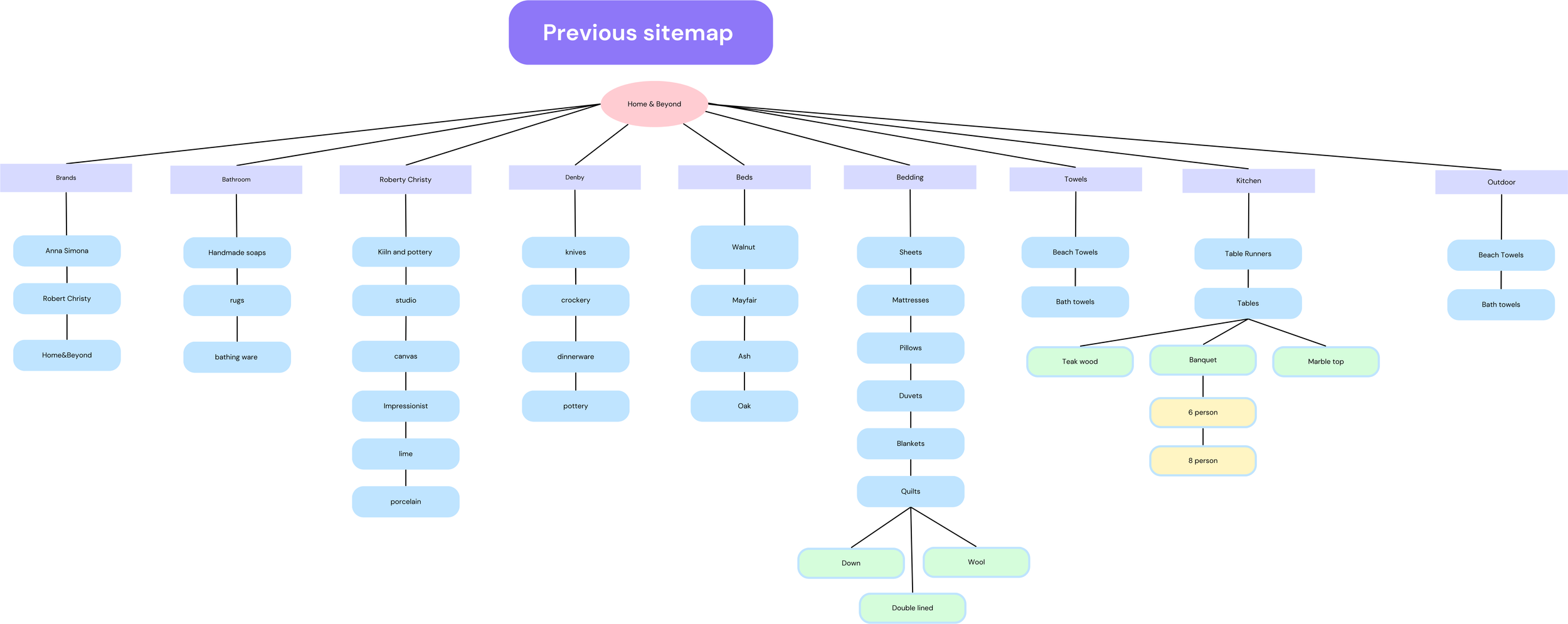
Complicated Navigation
The main navigation contains 11 subpages with unclear categorization, making the site structure difficult to understand. Related products and content are not grouped intuitively, forcing users into repetitive back-and-forth navigation. This creates unnecessary friction and weakens the overall discovery experience.
Initial wire-framing & Constraints
With the problem statements defined, I moved into low-fidelity wireframing and iterated based on feedback from the development team. My front-end background helped me understand implementation constraints and contribute to the foundational HTML, CSS, and JavaScript design components.
Since the existing website was built on Shopify, I also evaluated the platform’s native capabilities, customization limits, and e-commerce workflows. This ensured that the proposed designs were not only user-centered, but technically feasible within the existing development environment.

Sell the audience on an idea, not just the product
A key research insight was that users found the existing website uninspiring and felt the brand did not communicate confidence in its own products. Home&Beyond’s website relied heavily on product listings, discounts, and pricing, but these were not strong differentiators for a luxury-oriented audience.
The core issue was a lack of brand narrative. High-end buyers are not only purchasing a product; they are buying into an aesthetic, concept, and lifestyle. To address this, I shifted the design direction from a transactional e-commerce model to a more immersive, editorial experience.
The redesign focused on curated collections, stronger visual storytelling, contextual product pairings, and design-led browsing experiences. These elements were intended to communicate the brand’s creative vision, build emotional engagement, and position Home&Beyond as an arthouse design studio rather than a standard furniture retailer.
Using this insight, I developed high-fidelity mockups and prototypes through an iterative design process, ultimately creating a final design system and screen flow for implementation.
Research showed that users rarely shop for isolated products; they look for cohesive sets that support a broader spatial concept. For hospitality buyers, this could mean sourcing coordinated pieces for a lobby, reception area, or outdoor setting.
The Shop By feature supports this behavior by letting users select product needs and browse curated collections that group complementary items together, improving discovery, cross-selling, and purchase confidence.
Shop by collection feature
This component delivers three key UX and business benefits:
Streamlined product discovery
It reduces repetitive navigation by helping users explore multiple related products within a single curated flow.Stronger inspiration and cross-selling
Instead of showcasing isolated products, the feature presents coordinated pairings, helping users visualize how items work together and encouraging deeper site exploration.Thematic decision support
Curated names and aesthetic-led collections translate abstract design preferences, such as “earthy sage tones” or “outdoor luxury,” into tangible product sets. This is especially valuable for hospitality buyers who need cohesive palettes and spatial concepts, but may not know the exact items to search for.
Simplified checkout page and optimal space usage
Guided by a show, don’t tell approach, I simplified the product and checkout experience by reducing competing CTAs and aligning the flow with familiar e-commerce conventions, while still preserving the brand’s visual identity.
Product imagery was consolidated into a single view, allowing users to assess multiple angles without extra clicks or cognitive overload. This helped create a clearer, more complete understanding of the product.
I also introduced concise iconography and at-a-glance product details for high-impact decision factors such as shipping, material, and safety standards. Surfacing this information upfront reduces search effort, improves transparency, and supports faster purchase confidence.
I added a “More Like This” recommendation carousel with Quick Add functionality, enabling low-friction cross-selling directly from the PDP without forcing users to exit the current flow.
I also introduced a hover-state tile linking to curated collections. By limiting the PDP to two primary conversion paths—Add to Cart and Explore Collections—the design reduces CTA overload, minimizes unnecessary page redirects, and supports a more focused, discovery-led shopping experience.

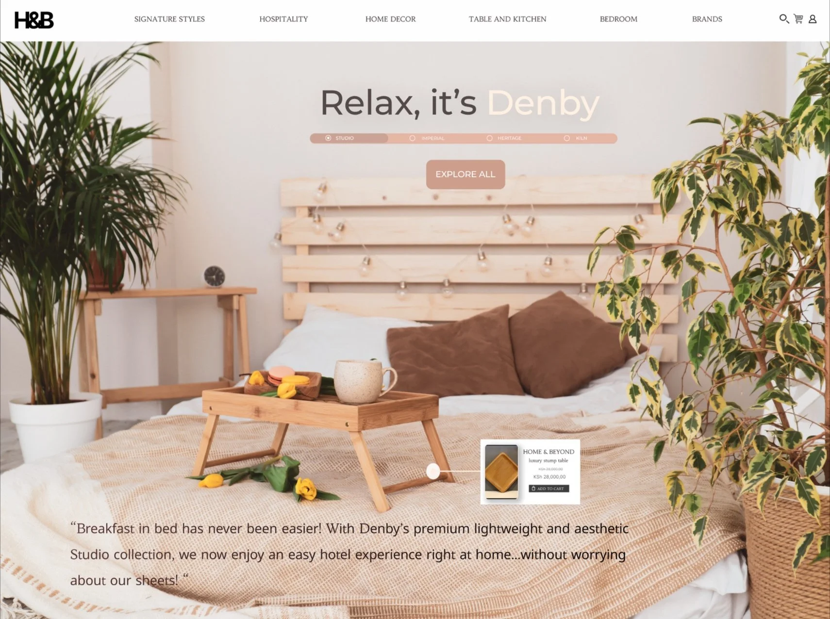
In this screen, Denby products are featured through a full-bleed brand banner. The copy is not a standard product description; it reinforces the visual concept and strengthens the brand narrative. A single primary CTA directs users to the brand listing page, keeping the interaction focused.
This iteration also tested an alternate hover-select pattern. While the client preferred this visual treatment, accessibility and technical constraints around the smaller circular hotspot led to the implementation of the larger interaction zone shown earlier.
Full screen immersion with product showcasing
A key pattern identified in the competitive analysis was the use of full-bleed homepage hero banners, which create a more immersive first impression and direct user attention toward the featured product within a complete spatial context. Compared to discount-led promotional banners, this approach supports stronger visual hierarchy, reinforces product positioning, and communicates value through imagery rather than sales messaging.
I extended this pattern through a hover-select interaction, allowing users to directly engage with and add featured products from the hero environment. This bridges inspiration and conversion by making showcased products immediately actionable.
The homepage was intentionally limited to a single exploratory interaction model—a scroll-based sequence of fullscreen feature banners—without introducing excessive calls to action. This reduces promotional clutter, supports discovery-led browsing, and keeps attention on high-value products the client wants to prioritize. The approach is especially effective for premium, large-format items, where visual emphasis and contextual presentation are critical to perceived value.
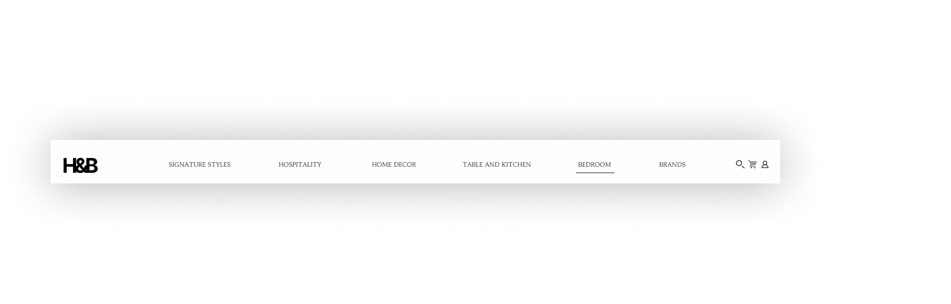
Targeted exploration through organized information architecture
The existing site had a cluttered top-level navigation structure, making product discovery inefficient. To improve information architecture, I applied Miller’s Law to reduce cognitive load and consolidate the menu into six primary categories.
Using Shopify analytics and stakeholder requirements, I defined an initial navigation framework, then validated it through a closed card sort to ensure the structure aligned with user expectations and browsing behavior.


Social media carousels introduce user-generated content as a trust and validation layer within the purchase journey. Public, profile-linked posts provide stronger social proof than anonymous text reviews, reducing perceived review manipulation and increasing brand credibility.
They also improve product evaluation by showing furnishings in real-world contexts, supporting better assessment of scale, material finish, styling compatibility, and use-case fit outside controlled studio photography.
Incorporating the human connection
To add a stronger human layer to the digital purchase journey, I proposed expert-curated collections led by celebrity interior designers, influencers, and industry collaborators.
This feature positions Home&Beyond as more than a product catalogue; it creates social proof, editorial authority, and aspirational value. Over time, the same space could support hotel partnership showcases, designer collaborations, and magazine-style features, reinforcing the brand’s shift toward a premium design studio identity.


Responsive Design
Although desktop generated higher traffic, mobile remained critical for individual retail users and cross-device continuity. I designed responsive layouts across three viewport specifications, defining breakpoints for key flows such as Shop by Collection and restructuring dense screens like checkout for mobile usability.
This ensured consistent visual language, interaction patterns, and information hierarchy across all 75 screens.

Results
Increased signature item sales by 37%
Post-redesign, sales of promoted signature furnishings increased by 37%. Hospitality buyers drove approximately 70% of these sales, with individual retail users contributing the remaining share. Notably, over 61% of high-value purchases were made through curated collections, validating the redesign’s focus on bundled discovery, contextual merchandising, and collection-led conversion.
Tremendous social media presence and improved SEO
SEO-led design decisions improved Home&Beyond’s organic search visibility across relevant furnishings queries. Additionally, influencer-led campaigns and social media carousel integrations contributed to 33% of new customer acquisition, based on self-reported feedback from the “How did you hear about us?” form.
Improved webpage footfall by 76%
The redesigned information architecture improved subpage visibility, reduced navigation friction, and made product discovery more intuitive. As a result, average traffic across product pages increased by 76%, indicating stronger exploration and improved findability across the site.
Outnumbered third party vendor sales by 41%
Post-redesign, third-party sales through platforms like Amazon remained largely stable, with only a slight decline over time. Meanwhile, direct website sales exceeded third-party sales by 41%. This suggests the redesign did not simply shift existing demand away from intermediaries; it expanded direct conversion by creating a stronger, more differentiated brand and shopping experience.
53% jump in secondary sales by return users
This increase was seen mainly by the everyday user audience and goes to show the effectiveness of the redesign in addressing our second important audience group. While hotel managers representing business houses placed larger bulk orders, 53% of our everyday users made a secondary sale within 2 weeks of the initial purchase.
Increased mobile app demand
While desktop remained the primary channel, mobile traffic increased by approximately 25% post-redesign. This growth indicated stronger demand for mobile-first interactions and informed the decision to explore an app-based architecture, which is now under development.