Outcomes
Project opportunity
Out of the 50+ submissions, were one of the top eight teams selected to present our work at ISRO and NASA’sJohnson Space Center. Our work was described as “one of the most practical, and research driven designs I have ever seen from students; (there are) a lot of interesting elements that we at NASA will seriously take forward.”
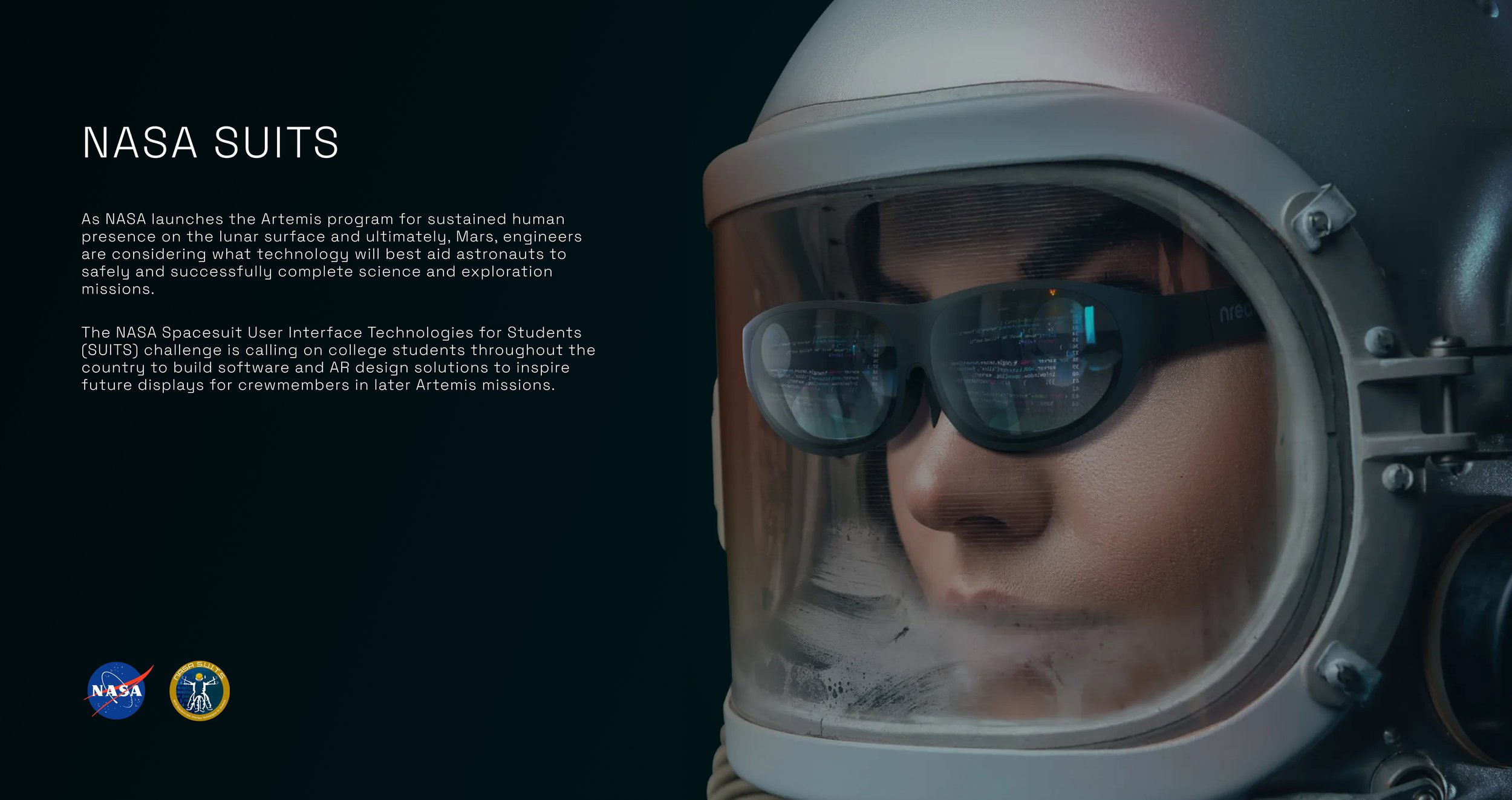
The NASA SUITS project focused on designing an AR-based spacesuit interface for EVA operations on the lunar surface. Built for platforms like Microsoft HoloLens, the UI needed to support astronauts through non-intrusive, heads-up interactions across four core tasks: egress, rover commanding, navigation, messaging, and geosampling.
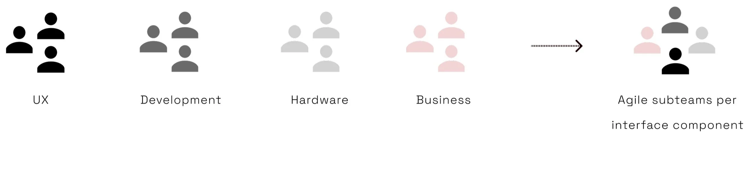
Team Structure
Timeline

My role
I worked as a UX & AR Designer within the 10-member UX team, contributing across research and core interface design.
In later phases, I served as scum master and UX design lead for a 6-member agile sub-team. While involved across the full design process, I owned the geosampling flow.

What is the experience of being in space?
A key research constraint was that we were designing for an extreme context we had no lived experience with. Unlike consumer products, there were no familiar interaction patterns to rely on, so we began with foundational domain research around EVA workflows, astronaut training, suit limitations, visibility, communication protocols, and equipment handling.
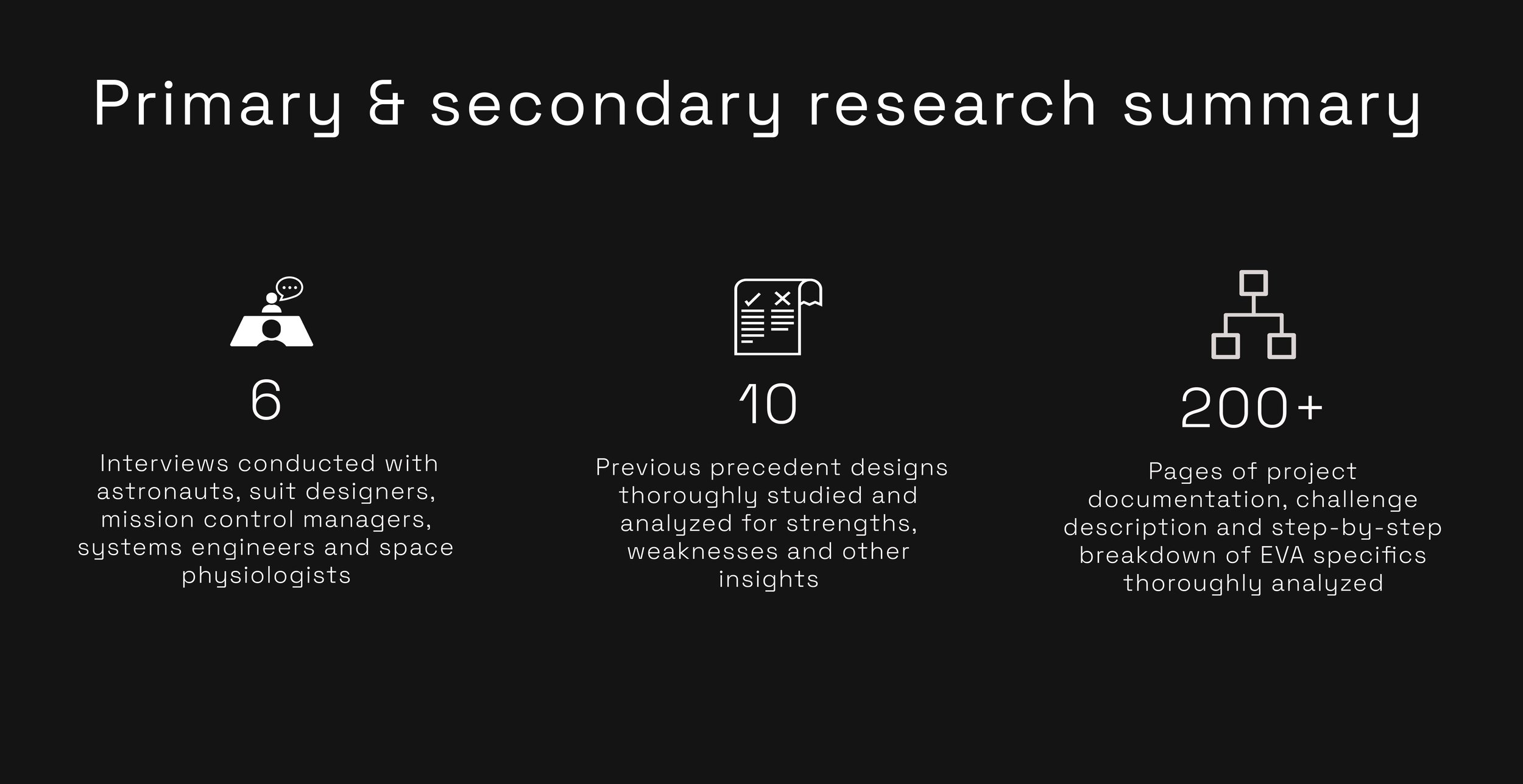
To ground the design in real operational needs, our UX team conducted interviews with six NASA-affiliated stakeholders, including astronauts, suit designers, mission control personnel, and space technicians. I personally interviewed an astronaut and a suit designer. Post-interview synthesis sessions helped us extract key insights, identify follow-up questions, and translate mission-specific constraints into actionable design requirements.
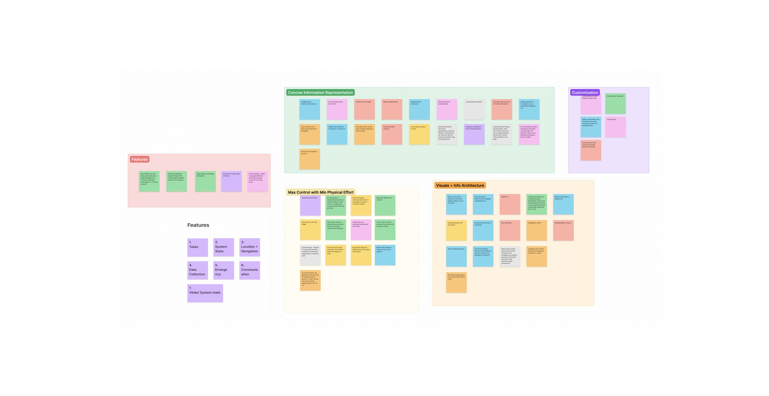
group whiteboarding and affinity mapping session post all the interviews to summarize and cluster our findings and identify core design tenets.
Core Design Tenets
Because NASA SUITS was a large, multi-component interface, the UX team split into agile subteams across later sprints. To maintain consistency, we defined shared design principles based on research insights and mission constraints.
These guidelines acted as a North Star, aligning all subteams around core objectives while allowing each group to design for their specific workflow.
Peripheral Design & FOV Management
For EVA operations, unobstructed vision is mission-critical. The AR interface must avoid the astronaut’s central field of view and prioritize peripheral placement for HUD elements. This ensures key information remains accessible without creating visual obstruction, cognitive strain, or operational risk
Redundant Interaction Model
Although gesture input is standard in AR systems, astronaut interviews revealed that suit mobility limits and oversized gloves make gesture-based control imprecise and unreliable. The interface must therefore support alternative input methods, with a secondary failsafe interaction path to reduce error risk during mission-critical EVA tasks.
Prioritized Information Hierarchy
Given the constraints of AR viewing in EVA contexts, the interface must minimize dense or dynamic text. Information should be prioritized by task relevance, urgency, and safety impact, using concise visual indicators wherever possible to reduce cognitive load, disorientation, and decision fatigue.
Clarity Over Aesthetics
In high-pressure EVA contexts, usability takes priority over visual novelty. The interface must use large hit areas, stable color systems, clear CTA boundaries, and simple typography to support fast recognition, low-error interaction, and mission-critical clarity.
Space-Specific Accessibility
Although astronauts meet strict physical and cognitive requirements, the interface must account for EVA-specific impairments such as hypoxia, suit malfunctions, constrained mobility, and visual strain in high-contrast lighting. Design decisions must prioritize legibility, error tolerance, low physical effort, and reliable interaction under degraded operating conditions.
Learnability With Familiar Fallbacks
Astronauts can be trained on novel AR workflows, allowing room for unconventional layouts where operationally useful. However, under high-pressure conditions, familiar iconography, secondary cues, and recognizable interaction patterns must be retained to support quick decision-making and reduce error risk.
main/home state
We explored multiple low-fidelity sketches to define the home screen structure, prioritize mission-critical elements, and test spatial layout options. Since AR allows depth-based interaction, we also evaluated screen layering to determine how information should be organized across foreground, peripheral, and secondary display planes.
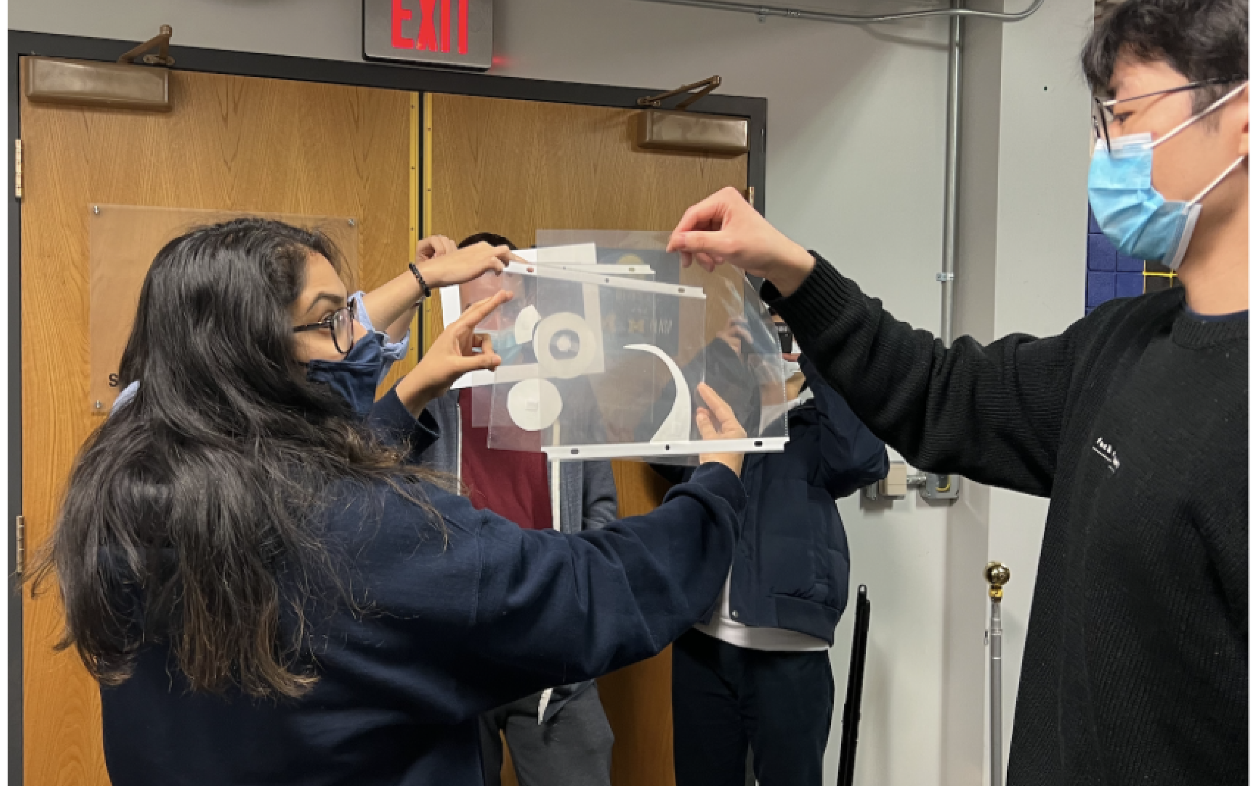
We extended layout testing through physical prototyping, building curved display mockups to simulate the AR viewing environment. This helped us evaluate depth, spacing, and visual reach, and define comfortable interaction and visibility zones for interface placement.
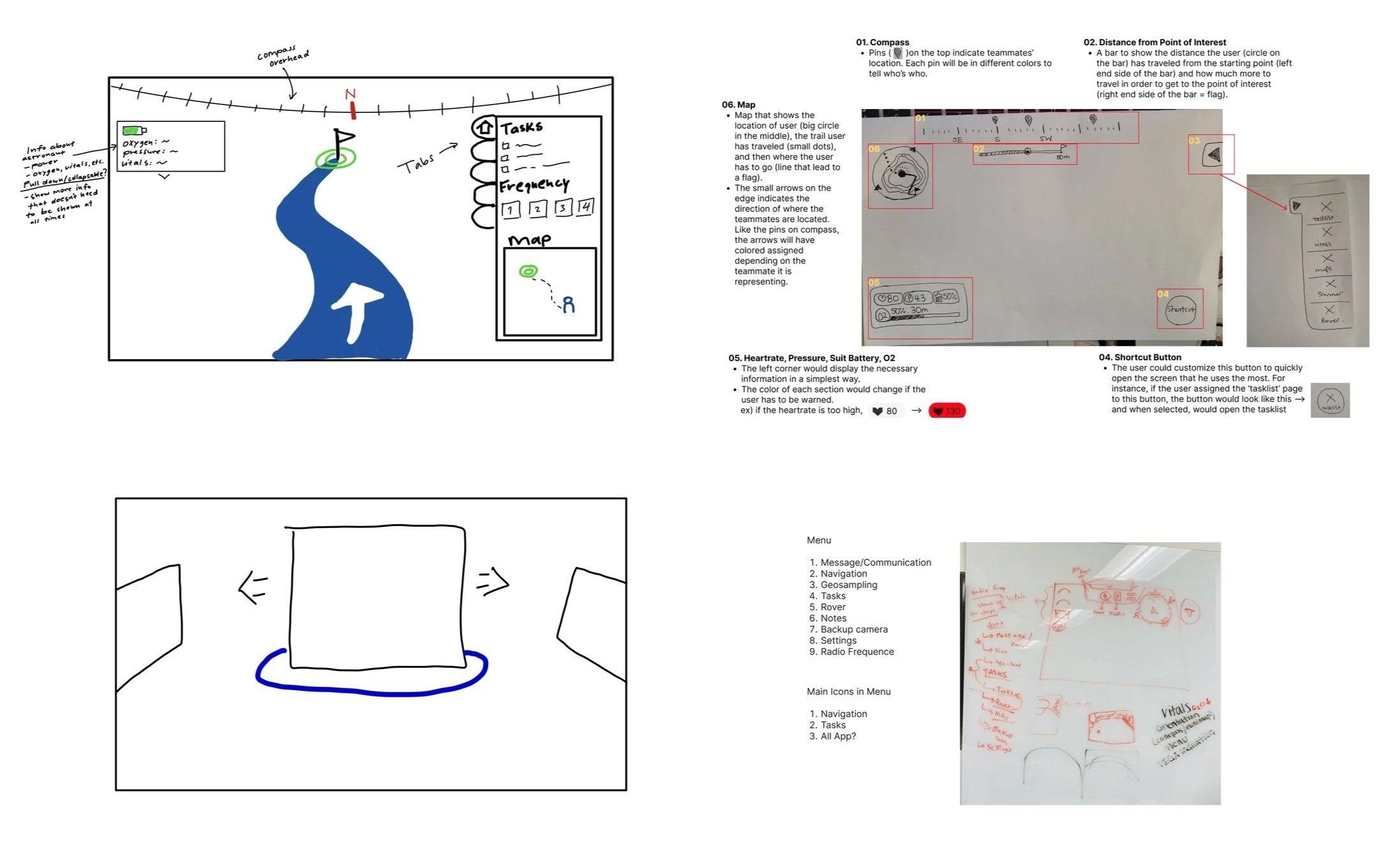

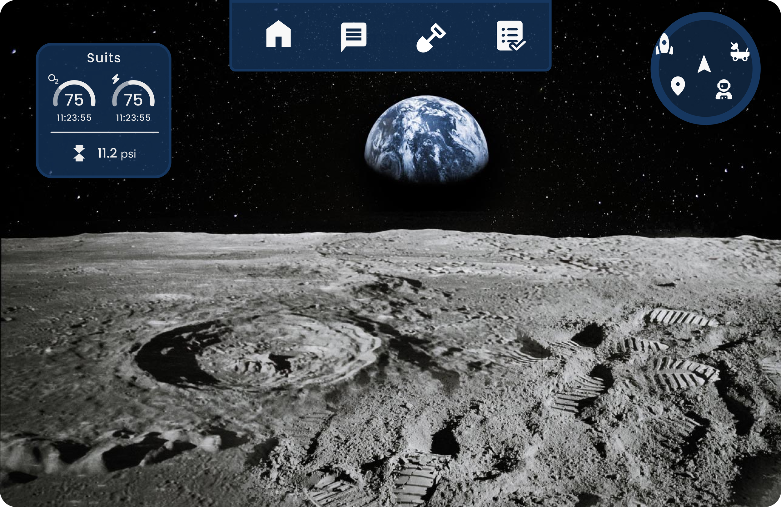
After some repeated testing and back and forth with the development team, we proceeded with the following main state screen
The HoloLens prototype helped validate key interaction and layout decisions. Eye-tracking proved unreliable due to accidental triggers and ambiguity between intentional blinks and passive gaze. Head-tracking performed better, allowing us to define minimum spacing between selectable elements, with voice commands added as a secondary input method.
The first HITL test also validated iconography as an effective support layer for information panels. Testing across varied lighting conditions helped refine the color system and style guide.
Rapid prototyping further informed our panel architecture: for critical sequential workflows, we chose layered AR panels, similar to pop-up states, over side-by-side world-anchored panels to improve focus, hierarchy, and task continuity.
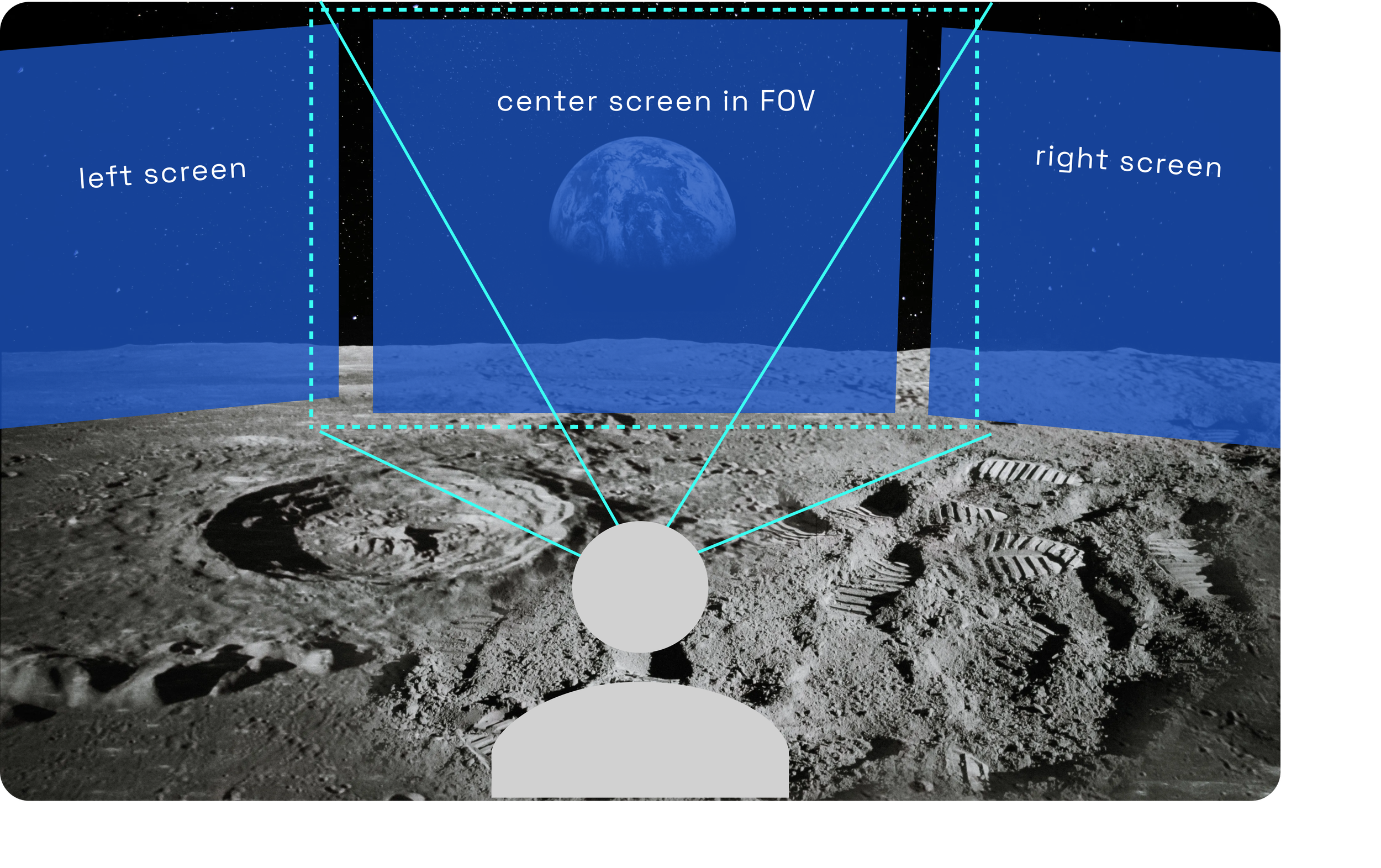
The above figures represent how a seeded panel is structured. Panels positions are fixed relative to the AR headset’s axis and only ‘move in’ to the field of view when the observer turns. By changing their direction of sight towards the panel’s fixed positions, they bring the existing left and right screens into the device’s current field of view.
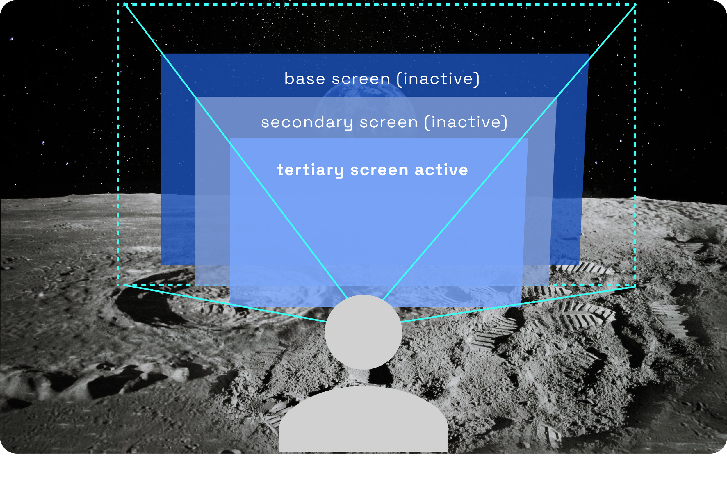

Layered Panels Over Seeded Panels
Seeded panels created usability issues for a head-gaze interaction model, especially in low-stability EVA conditions. Requiring astronauts to physically turn toward fixed interface locations increased interaction effort, reduced task focus, and created risk in emergency scenarios where mobility may be constrained.
We therefore moved to a layered panel architecture, where critical utilities appear within a consistent, centralized interaction space. This reduced spatial recall, improved response time, and kept sequential workflows focused without forcing astronauts to search across the AR environment.

The figures above illustrate the layered panel model. Related or subsequent screens open as overlays on top of the current panel, creating a clear sequential hierarchy.
To reduce interaction ambiguity, only the foremost layer remains active at any given time; hit areas and actions from underlying layers are disabled until the top layer is closed.
This structure supported a clear information hierarchy, sequential task flow, and stronger spatial predictability, allowing astronauts to build a mental model of navigation across utilities. When designed with controlled opacity and non-obtrusive overlays, layered panels also enabled critical step-by-step interactions without overwhelming the user.
It further allowed us to establish a persistent home screen as the primary navigation anchor, making it easier to group functions logically, prioritize high-value utilities, and maintain consistency across workflows. The rover, messaging, and geosampling components all applied this layered interaction model.
We will see this screen in detail in the geosampling section, but here the geosampling frames are layered over the home screen without overlap. The contrast helps in differentiation and the Home Screen hit zones are inactive
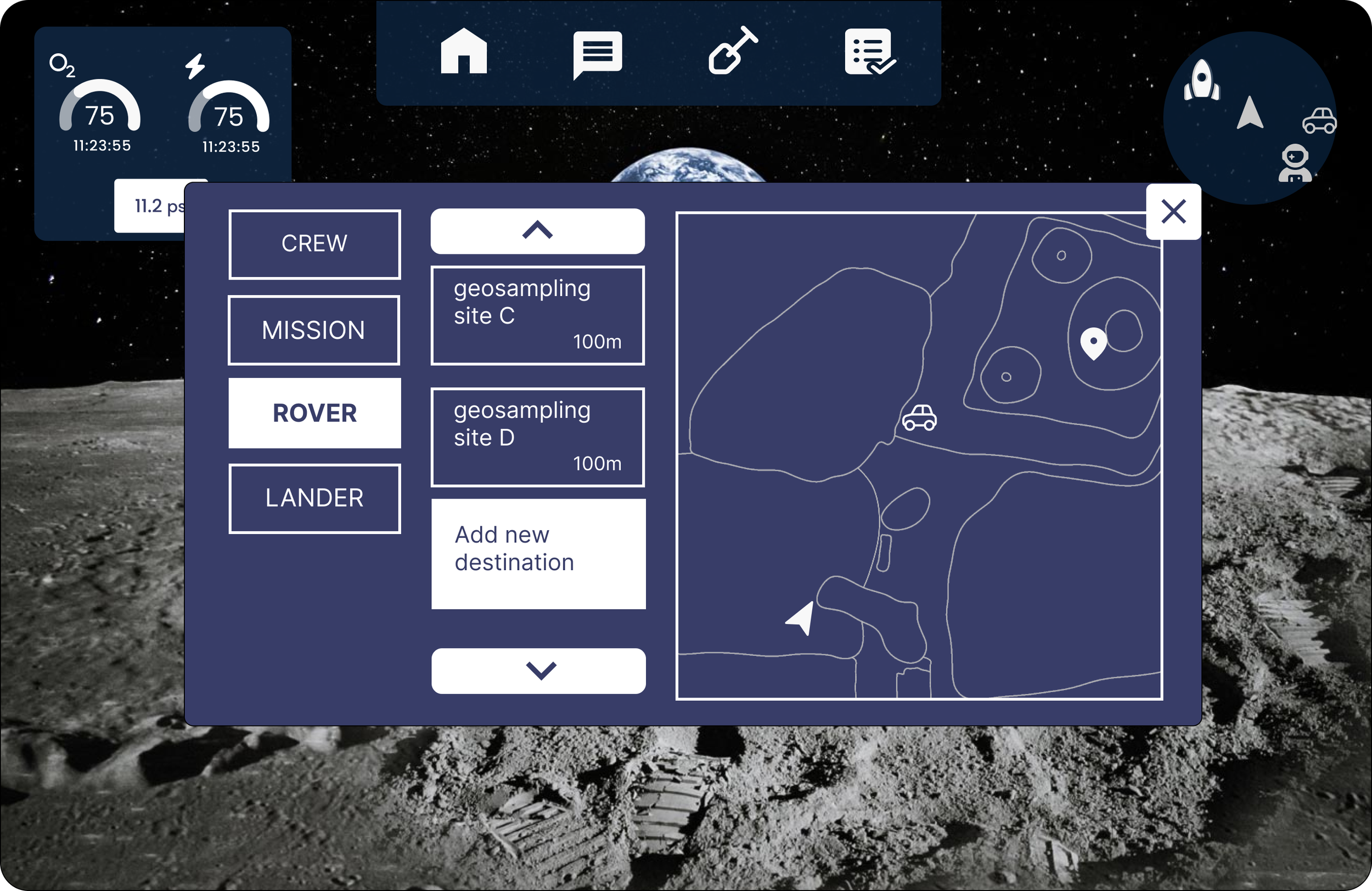
In the rover workflow, some visual overlap with the Home Screen was unavoidable due to the terrain map’s spatial requirements and the number of task-specific controls. To preserve clarity, the layered panel uses stronger contrast to distinguish the active rover state from the underlying interface. While this panel is open, all Home Screen elements remain inactive until the rover layer is dismissed.
geosampling
In a geosampling EVA, astronauts use a connected spectrometer to scan lunar rock samples and capture data such as chemical composition, size, and sample metadata. After the scan, astronauts can add field observations to the generated sample file.
I worked on this component within an agile subteam of UX and development members. We began by synthesizing astronaut interviews and project specifications into key geosampling scenarios and user journeys for a typical EVA workflow.
A minimap module used icon-based wayfinding to surface mission-critical reference points, including the home base, rover, target destination, and nearest astronaut. Proximity was communicated spatially within the map: closer entities were positioned nearer the astronaut marker, while more distant points appeared toward the periphery.
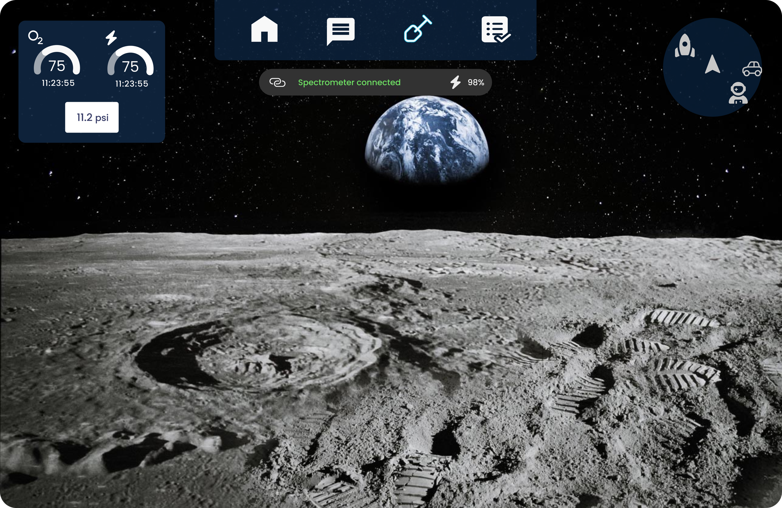
Oxygen, pressure, and suit battery were treated as persistent high-priority system indicators. Each was represented using familiar iconography, a prominent percentage readout, a visual progress arc for quick status recognition, and an estimated time remaining value to support rapid situational awareness.


Video Playback
Here’s what the above geosampling flow looks like in our final design. There’s a lot of interesting elements in each screen to unpack and discuss.
Screen-by-screen breakdown
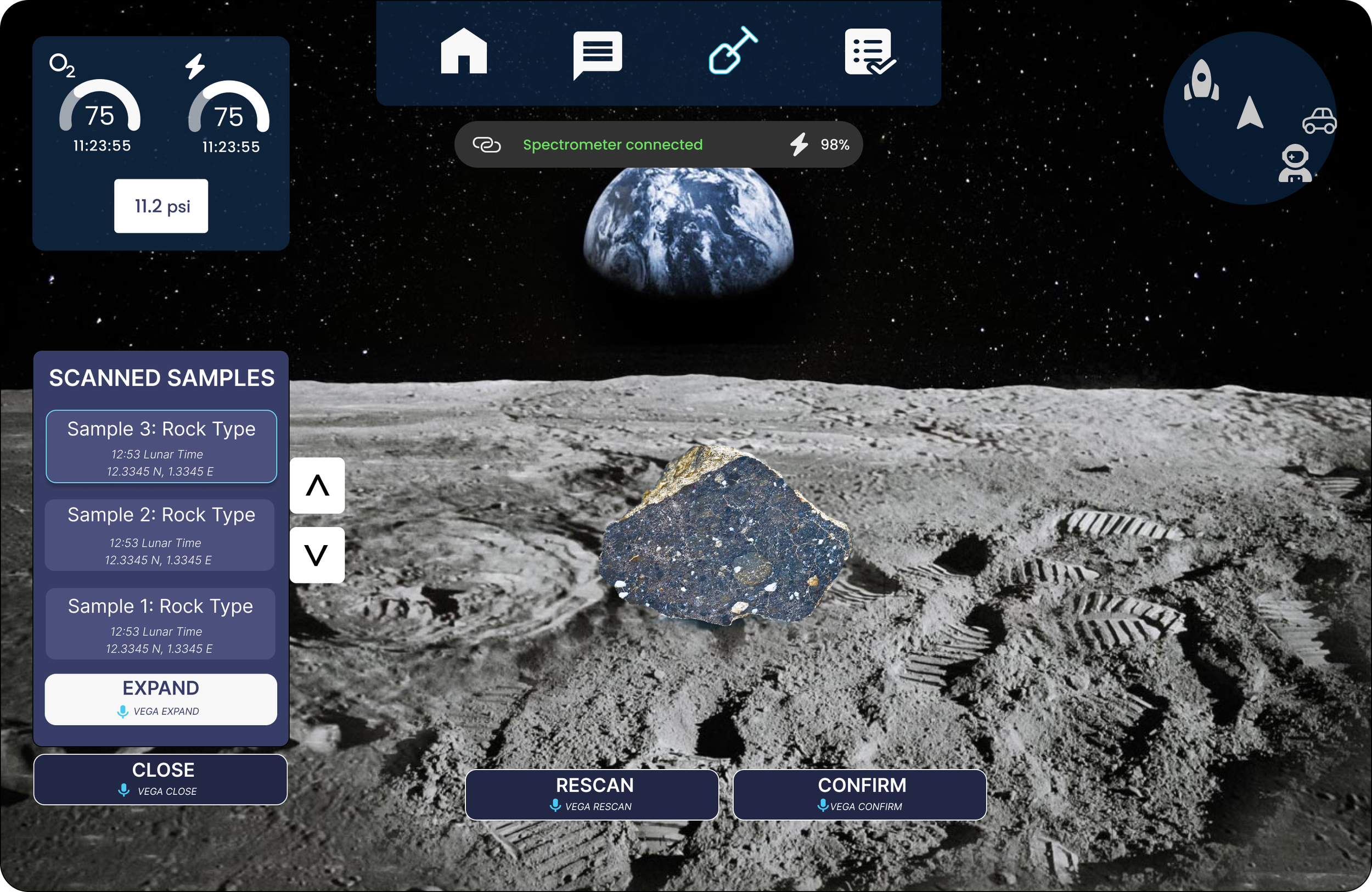
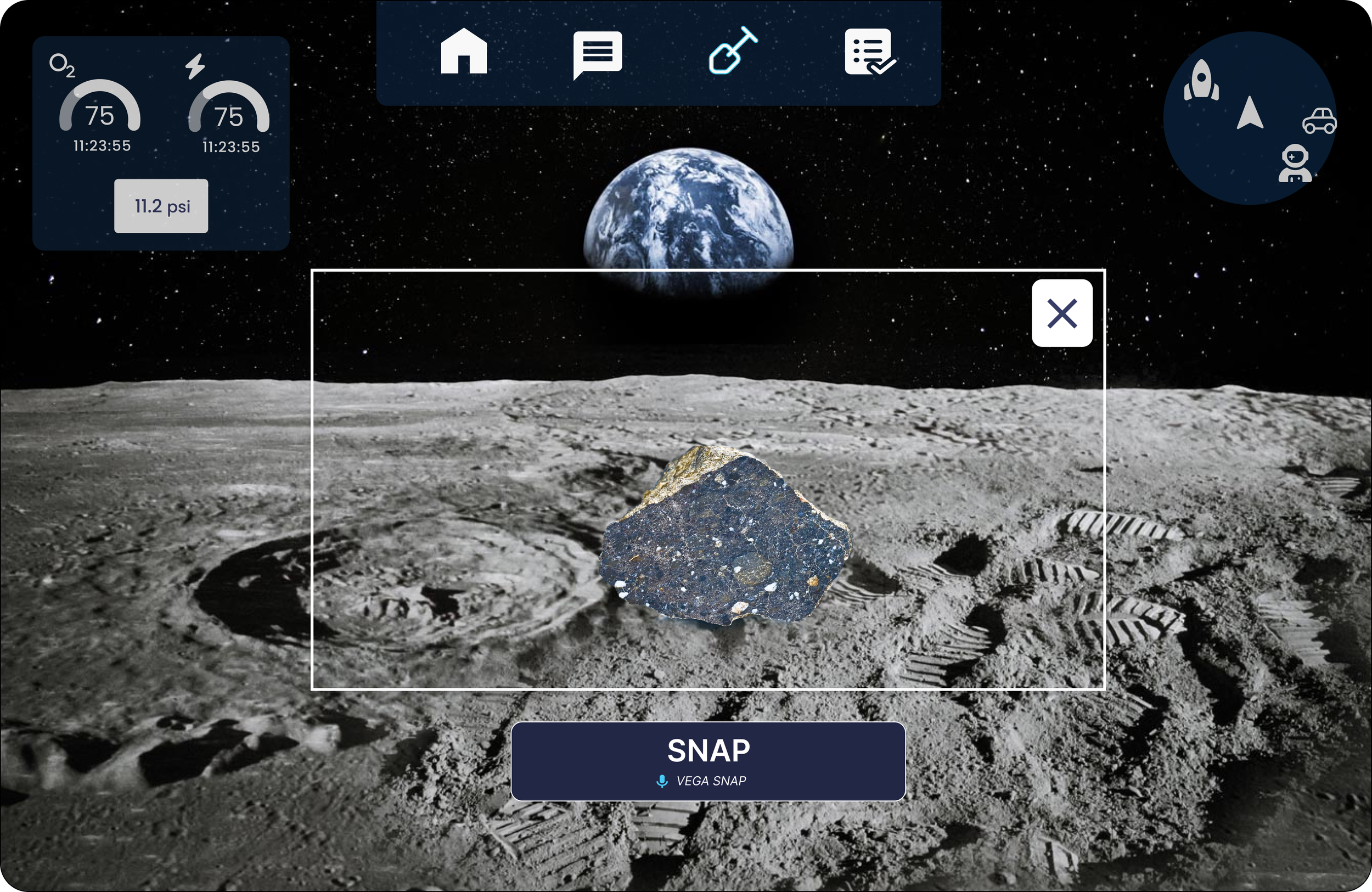
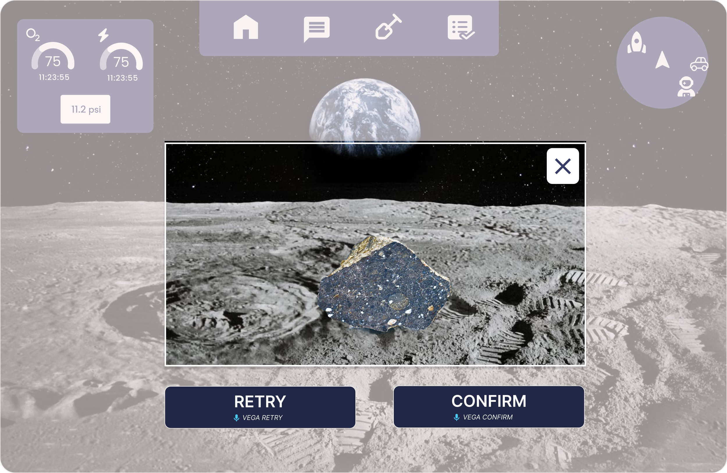
The spectrometer connection status is displayed at the top using familiar design standards. The astronaut can now scan a rock using the attached device
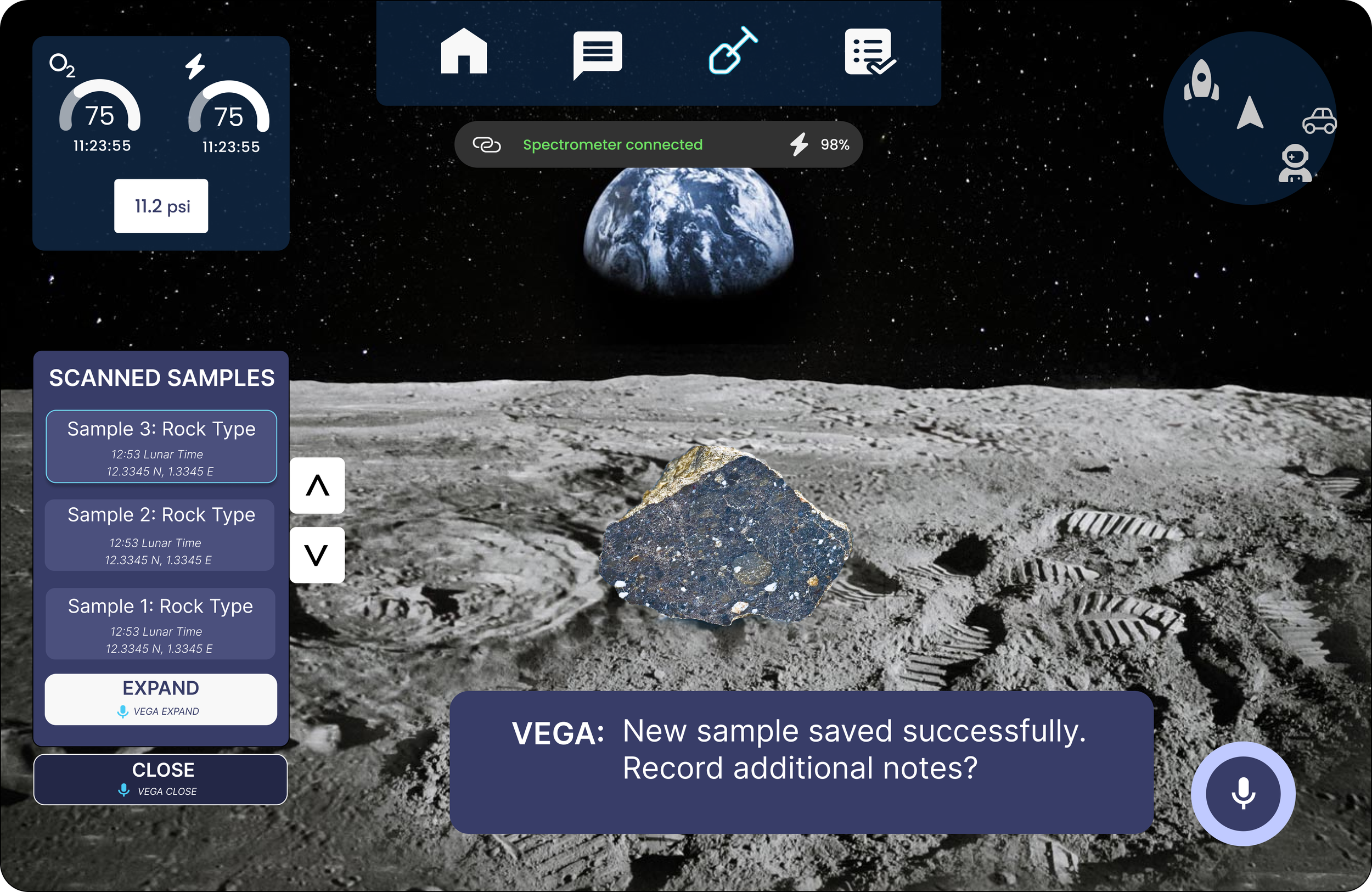
Once a rock is scanned, the Scanned Samples panel opens as a new geosampling layer, with the active sample highlighted. A differentiated color scheme reinforces the layer transition, while underlying Home Screen elements are disabled until the geosampling workflow is closed, preventing accidental activation and reducing interaction conflict.
To support repeatable, low-error use, we kept the interaction model intentionally simple. Rather than making each sample independently selectable, we used a scroll-and-expand pattern to reduce interface complexity and preserve a scalable voice command structure.
All interactive elements are clearly bounded and high contrast, including sample scrollers and the core actions: Expand, Close, Rescan, and Confirm. In line with our dual-input model, the primary interaction method is head gaze, supported by voice commands as a secondary input. Each standard action is paired with a microphone icon and command phrase, enabling astronauts to progress through the workflow hands-free while maintaining attention on the sample and surrounding environment.
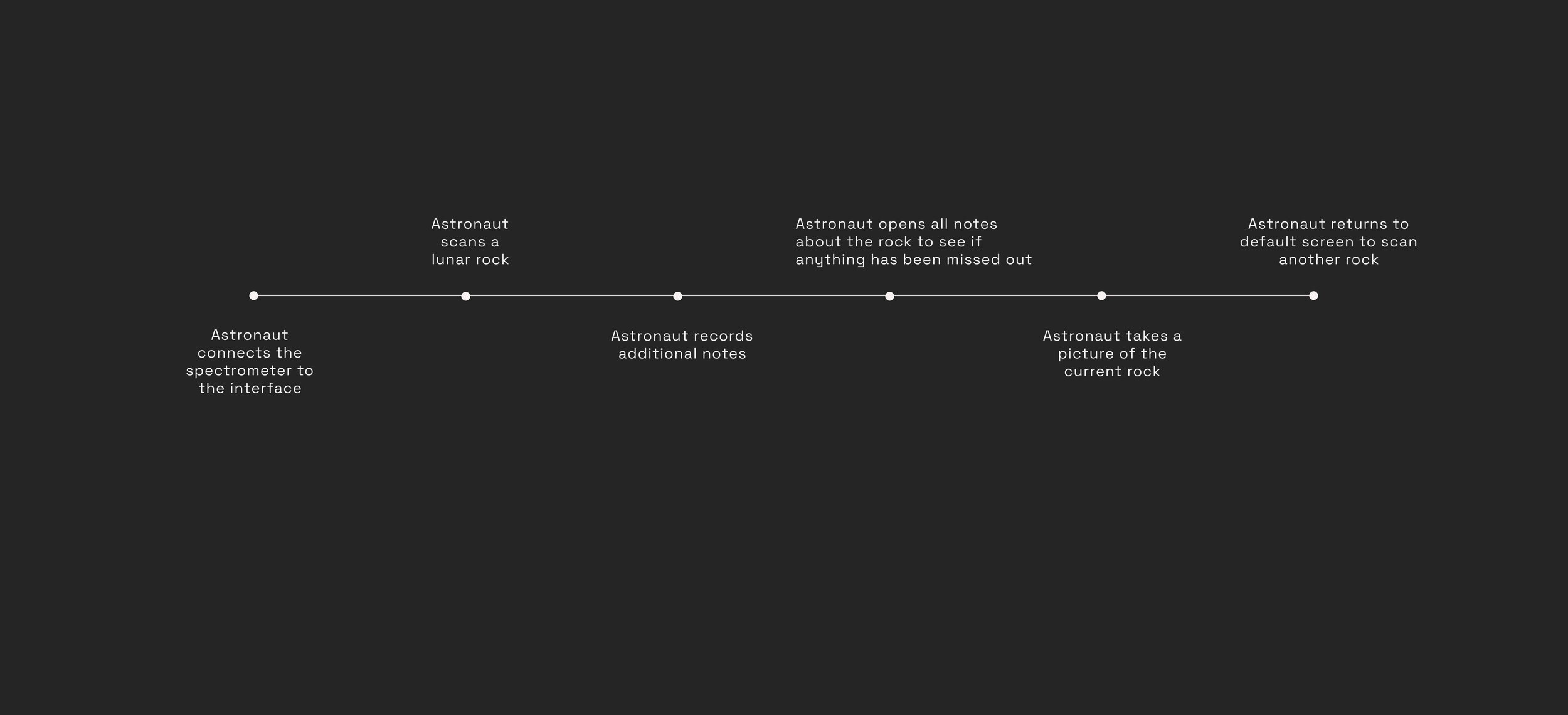
On choosing confirm on the previous screen, VEGA - our voice assistant - notifies the astronaut that the sample has been recorded. (choosing ‘rescan’ would have just allowed you to scan again, and ‘close’ would have closed the geosampling layer. We will see the ‘expand’ screen later).
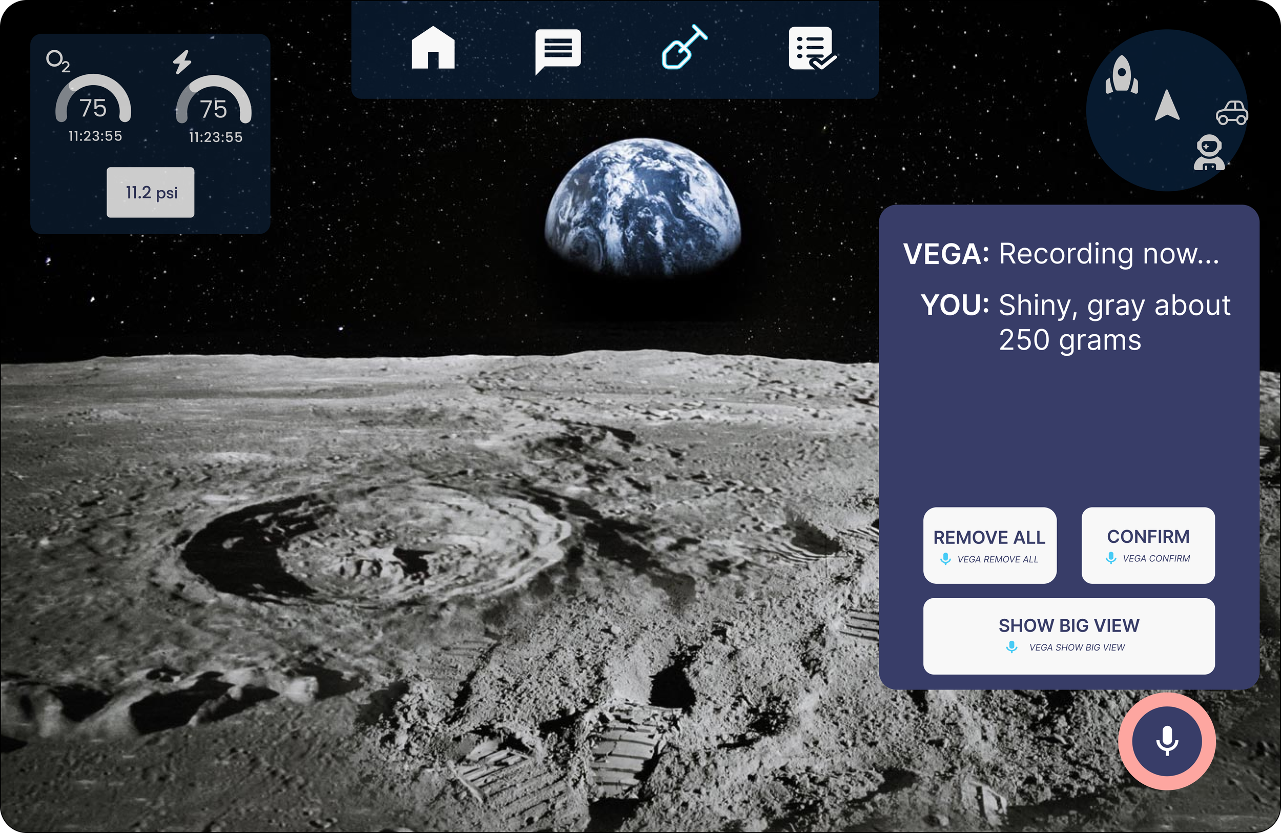
VEGA now asks if the astronaut wants to record additional notes. The captioning and ring highlight are secondary indicators.
The Show Big View state is an intentional exception to our peripheral-first design principle. It temporarily occupies the central FOV with higher opacity and expanded text to support review of longer, unstructured voice notes.
While several alternatives were explored, text remained the most reliable format for displaying uncategorized user-generated content. This pattern was also applied to messaging, where full-text readability outweighed the need for peripheral placement.
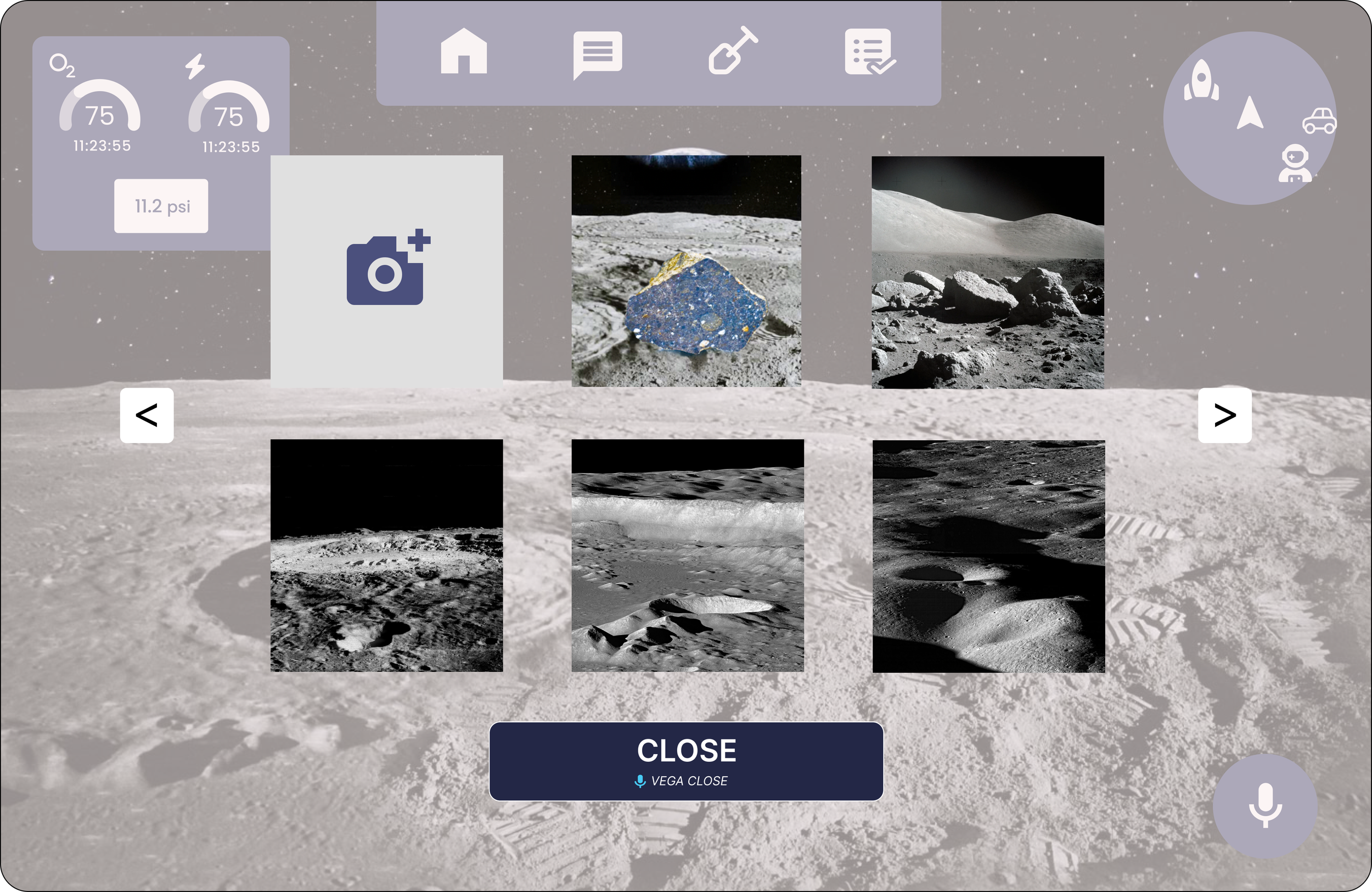
On opening ‘gallery’, the astronaut can access the photo log and activate the camera by clicking the top left box. While this screen is more centrally structured in the FOV, comfortable spacing and transparency makes it less distracting.


The astronaut records an observation by voice—for example, “shiny, grey, about 250 grams.” The interface then surfaces the transcribed note for immediate verification and provides a Remove action for error correction.
If the note exceeds the preview area, or if the astronaut needs full note visibility, a Show Big View command opens an expanded state. We intentionally used a distinct command phrase instead of Expand to avoid ambiguity within the voice interaction model, where Expand was already mapped to a separate action.
The Minimize control was intentionally designed with lower visual prominence and a smaller hit area because it is less reversible than the other actions. Reducing its prominence lowers the risk of accidental activation. Its placement also draws from familiar window-control conventions, using corner positioning to support recognition while avoiding the more gaze-prone upper-left region of the FOV.
More broadly, several interaction patterns deliberately prioritize clarity over contemporary minimalism. Scroll arrows were kept consistent across screens instead of using less explicit scroll behaviors, and note deletion uses large, clearly bounded minus controls rather than subtle iconography. In an AR environment—especially under low-gravity, low-precision conditions—large, high-visibility hit targets are essential for reliable interaction.